Friday, August 31, 2007

Perspective - Observation

If you've taken any basic visual art course, you've been exposed to perspective. Vanishing points, two-point perspective -- terms you most likely have heard and concepts you most likely have used along with all the other terms and concepts.

Perspective is just illusion, a product of how the lens of our eye projects light onto the "picture plane" of the retina and of how our brain interprets the resulting pattern. Railroad tracks don't really converge six miles away to a single point, do they? No, of course not, but we have to have some kind of rule or tool so we can make order in our drawing and painting and create a convincing work of art.

The rules of this "grand illusion" were first invented by goldsmith Filippo Brunelleschi (1377-1446) and later codified in a treatise by humanist Leon Battista Alberti (1404 - 1472). (For more on the history of perspective, see http://www.math.nus.edu.sg/aslaksen/projects/perspective/theory.htm.) Artists have been using these rules ever since. If you want to get real technical you can study perspective and learn to produce technical drawings which is not a bad thing since many people make their living doing just that. But, you don’t always have to be so technical when you paint. Like almost everything else, getting your paintings to look real comes down to observation. Paint what you see. Look for shapes and paint them. Put the puzzle pieces together.

Callaway painter, Durinda Cheek reminded me the other day when we were talking about having confidence in brushwork that it’s the same thing with color. Paint what you see. “Mix your color to match what you see,” said Durinda. She explained further, “A fellow painter put it simply, "Is it too dark, too light, too bright, too dull?" In other words, don't just put paint on the surface if it isn't right. One thing you can do is load your brush and hold it up to compare it to your subject. Some artists even put a small stroke on the canvas, compare it, and if it isn't right, wipe it off! “ Good advice Durinda.


Sunlit
Watercolor
22 x 30
$1200.00 + shipping/ handling
White rag mat with gold carved wood frame

You can see more of Durinda's work at www.durinda.com

Note to mailing list: To view past blog messages or to make a comment on the public blog, click here.

Thursday, August 30, 2007

Marsha Savage Fall Workshop


Marsha Hamby Savage "Fall" Plein Air Workshop

Blue Ridge, Georgia - Blue Ridge Mountains Art Association
Registration: 706-632-2144

Dates: Friday, Saturday and Sunday, Oct. 5, 6, & 7.
Times: Friday, 8:30 - 4:30, Saturday and Sunday from 9:00 to 4:30 with about
45 minutes break for lunch.

Cost: $200
Deposit: $75 - to be received by Sept. 21 (two weeks before)

Students: Minimum # 5 --- Maximum # 15 -- If we reach the 5 minimum by
that date, the class would be made, and students could keep signing up until
the day of the workshop.

First morning for about 30 minutes for meet and discuss locations -- and in
case of rain any day -- art class studio would be needed.

Description: The class will consist of instruction on composition, quickly
choosing a scene, thumbnail sketches, value, temperature, and color theory
when painting on location. Demonstrations will be in pastel, but I also
paint in oil and acrylic. Students are allowed to work in any medium as long
as they are not beginning students. Pastel students can be beginners. This
class is appropriate for beginners through advanced/professional. Most
information taught is appropriate for all mediums as the issues are specific
to painting on location versus studio. If it should rain, we will paint
still life, or from photographs -- with information on how to make a
painting look as if painted on location. Critique would be last afternoon.
Supply list will be given upon registration.


To view past blog messages or to make a comment on the public blog, click here.

Wednesday, August 29, 2007

Featured Callaway Painter, Barbara Davis

Some of you may not have met Barbara Davis who lives in Montgomery, Alabama and comes to paint at Callaway every chance she gets, so I thought I share some of her wonderful work with the group.

Meet Callaway Painter Barbara Davis:


Barbara's passion is painting en plein air - in the open air, from life. She says, "I love to paint our Southern landscape and landmarks in the area. Born and raised in Montgomery, I have painted since I was 14 years old and majored in art at Auburn University in Montgomery."


Hope you enjoyed looking at Barbara's work as much as I did, and I hope to run into Barbara again painting at Callaway. Barbara, you'll have to let us know what you've been doing lately.


To view past messages or to make a comment on the public blog, click here.

Tuesday, August 28, 2007

Palettes

A couple of years ago I had the opportunity to attend a workshop lead by Robert Gamblin. Robert is a wonderful artist and a great speaker plus he is just a nice man. It was a pleasure to be in his class. Robert is founder of Gamblin oil colors and while he does not sell any of his oils on his web site, he is so passionate about getting artists to understand his way of explaining color that he has built pages and put together DVD's to help us all.

If you are interested in learning more about Gamblin colors and products, visit www.gamblincolors.com Be sure to look at this page where he explains color and where all colors fit in what he calls color space. I think you will enjoy reading other pages too. http://www.gamblincolors.com/navigating.color.space/index.html

Thinking today about palettes reminded me of a recent newsletter I picked up with the word palette spelled incorrectly. If I remember correctly the name of the newsletter was Pallette News. Mine you, I'm not the greatest speller, but this spelling made me smile thinking that whoever typed the newsletter had stuttering fingers or either the newsletter was going to be about the armpit plates making up a suit of armor. A similar thing happened when an art group was forming and wanted to call themselves Palette Pals. At first the spelling of palette was suggested as pallet which is a small blanket used mostly for children sleeping on the floor. We laughed thinking if we named ourselves Pallet Pals some might think we were a group of sleep mates. (It's a southern thing.) Then palet was suggested, and that didn't work, so we resorted to looking the word up in the dictionary. There are other palettes too... like palate for the roof of your mouth and pallet like the pallet goods are stacked on for transport. After that we all decided that we would have to come up with some way to remember how to spell the word for artist palette, but we never did think of anything.


To view past messages or to make a comment on the public blog, click here.

Monday, August 27, 2007

Confidence with painting

One thing I think we all have struggled with from time to time is having brush confidence. In Craig Nelson’s book 60 minutes to better painting he talks about developing the feel of the brush in your hand as well as developing the touch to canvas or paper. What we have to do is get ourselves on first name basis with our brushes and the support we are working from. For those that use pastel, it would be how the sticks are held in the hand and the different papers that can be used.

Quoting from Nelson: “Confidence in anything comes from repetition, and repetition leads to comfort and the mastery necessary to excel. Painting more quickly will lead to truly using the brush as a painting tool, not just an instrument for filling in between the lines.”

Here is what I find happens to me. I have confidence more in the studio than I do when I am working outside. I’m not sure why this is but a couple of things come to mind that I continue to work out.

1. Getting overwhelmed by the shear volume of things to paint outside. An example would be me in the middle of the Overlook Garden when all the azaleas are in bloom. Solution: Use my camera viewfinder to narrow my focus.
2. Moving shadows. Solution: Do a quick thumbnail of the shadow patterns and take a photograph to back up the thumbnail. Tape the thumbnail sketch to my easel and use it like a road map while I continue to paint the scene.
3. Getting too much paint on my canvas too quickly. Solution: Use some acrylic paint in the beginning to get the canvas covered and make the composition solid. Then if I want to finish up the painting with my oil paints I can do that and can rest assured that I’m painting over dry paint.
4. Rushing to get finished. When I paint outside I realize that I only have 2 to 2.5 hours to get the painting finished with the same lighting unless I want to come back to the same spot under the same conditions and paint some more. I think I need to reconsider why I am painting outside and remember that I don’t have to paint a finished work of art ready to sell. I can work outside to accomplish studies that I can then take back to the studio where I am more comfortable and have time to make other decisions, create larger works and certainly have a more polished work. There is nothing wrong with doing studies and using them this way. In the end, the people I sell my work to really don’t care if they can be called plein air works or not. They just want the scene captured so they can enjoy it over and over just like I do.

What are some of your confidence blockers? What confidence builders have you found? One confidence builder for sure is just painting and painting and painting like Nelson said. I still haven’t done the exercise we talked about using the minute timer. Maybe it’s because it reminded me of how rushed I always feel when painting outside. Maybe that's one of the reasons painting outside is such a great teacher when it comes to learning to paint.

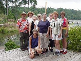
Today’s photograph is an old one from 2004 taken at the Discovery Center after painting all day. See anyone you recognize?

Left to right: Chris Hagebak, Barbara Robinson, Phyllis Franklin, Jo Adang, Bea Dallas, Cyn Kuffle, Durinda Cheek, Sandra Babb and kneeling, Bambi Setzer.

Saturday, August 25, 2007

Studio Exercise

As the summer heat still keeps most of us in doors painting in our studios, back porch, and living rooms I thought it might be a good time to do some speed exercises. Here’s one we all can try. I’d love to see some of you post your results. Let me know if you do this and need help posting, I’ll be glad to help you post it either on the blog or just on the yahoo discussion group. I plan to do this with some tomatoes from my 4 plant garden. After that, I’ll make me a tomato sandwich with Duke’s mayonnaise. I couldn’t use anything but Duke’s mayonnaise because my grandmother would turn over in her grave.

Exercise: Paint with a kitchen timer.

Choose a piece of fruit and set the timer for one hour on a 5x7 canvas. When the timer goes off, put your brush down.

Then set your timer for 30 minutes and do another on a new 5x7 canvas.

Then set your timer for 15 minutes and do another on a new 5x7 canvas.

Then set your timer for 5 minutes and do another on a new 5x7 canvas.

Finally, try a one minute painting.

Doing this exercise will teach you what is essential to get and what can be left out and still have a good painting. It may stop you from focusing on the end product and start seeing the process as everything. It will keep you from noodling, which is my favorite term for working a painting to death. It will also teach you to use economy of strokes and to think before you paint making sure you really need that stroke. It will teach you that if you put a stroke down with the right color and value, you won’t have to keep going back over it. Going back over your strokes time and time again usually doesn’t help the painting. It just shows that you were unclear with the first stroke and made a poor choice. That in itself is not a bad thing, it’s just that by making clearer good choices from the beginning our paintings can be fresher and more alive expressing what we really saw and excited us to begin with.

Today I thought I share a photo of Callaway painter Virginia Bugg in the garden painting.

To view past messages or to make a comment on the public blog, click here.
P.S. I understand that Yahoo is making changes to their data base and many of the email addresses that we have set up in our profiles may or may not work in the future. Last night I posted this same message and my post did not go thru. In trying to see why, I logged on to Yahoo and then signed on with my Yahoo I.D. and took a look at my profile. There in my profile I found that the last five messages sent to my hotmail address, which is my main address I use for all the Yahoo groups I belong to had bounced. When a mail bounces, it goes into cyber land never to be found again. I'm assuming that because my last five messages (to me) bounced my account was suspended! For this reason, the message I left on the blog yesterday did not make it to the Callaway painters Yahoo group to be posted and set out. :( When I found my address was on the bounce list and my email had been suspened, I also noticed that there was a link to have it restored. I clicked that link and made my request to have my email restored and received a confirmation back saying it had been. This morning I am sending out a duplicate of yesterday's post trusting it will reach you. You might want to check your Yahoo account and see if your email ID is on the bounce list. I understand that Yahoo will be doing purges of their data base for weeks to come, so checking your Yahoo account often might be a good thing if you want to continue to send and recieve messages associated with your Yahoo
ID.

Friday, August 24, 2007

To view past messages or to make a comment on the public blog, click here.

Basic color theory

Basic Color Theory


Color Wheel - 12 hues of the spectrum:

Warm Hues of the spectrum:
Yellow
Yellow-orange
Orange
Red-orange
Red
Red-violet

Cool Hues of the spectrum:
Violet
Blue-violet
Blue
Blue-green
Green
Yellow-green


Primary Colors: Red, Yellow & Blue

These colors cannot be mixed from any other colors. The triangle they form on the color wheel is called the primary triad.

When two primaries are mixed, secondary colors are formed:

red & yellow = Orange
red & blue = Violet
yellow & blue = Green
Orange, violet and green form the secondary triad.

When a primary color is mixed with a secondary color tertiary colors are made:

yellow & green = Yellow-green
green & blue = Blue-green
blue & violet = Blue-violet
violet & red = Red-violet
red & orange = Red-orange
orange & yellow = Yellow-orange
Complementary colors are colors that lie opposite each other on the color wheel.

The 3 major complementary pairs are: yellow & violet, blue & orange, and red & green.

The intermediate/tertiary colors all have intermediate complements:

red-orange & blue-green
yellow-orange & blue-violet
yellow-green & red-violet


When complementary colors are mixed, they usually produce a neutral gray.

When white is added to a color it becomes a tint.
When a color has been lowered in value by adding its complement or black, it is called a shade of the color.

Monochromatic color - color scheme using one hue plus white, neutral gray or black.

Analogous colors - three to five colors next to each other on the color wheel. They are more harmonious because they have a common primary color present in all of them.

Local Color - the actual color of an object; its middle tone.
The four characteristics of local color are:
hue - the color of the object: red, orange, yellow, green, blue, violet
value/tone - lightness or darkness
intensity/chroma - brightness or dullness
temperature - warmth or coolness

Thursday, August 23, 2007

What to do with an ugly painting


Spring Lake circa 2004 16x20 oil Candidate for the landfill gallery because I've worked, reworked, and completely destroyed any resemblance to this original painting. I should have stopped when I was ahead. I learn lessons each day.

____________________________________________________________________________

What to do with an ugly painting


I’m sure that most of us have paintings that fall into the categories of good, bad and ugly. I’m finding that to have a painting that I really think is better than good tends to run the course of about one out of three. So that leaves me with at least one painting in the bad or ugly category and I have to decide what to do with it.

The first thing I remind myself is that all art is a great experiment. I don’t care how long you have been painting or how accomplished you are, each time you create a work of art, you are experimenting and each experiment will turn out differently. Have you ever tried to paint the same painting? Did it turn out the same? Some of us have track records that turn out successful paintings all the time, but even if you are this kind of artist, you are still a student for we all learn every day from each painting we do.

The second thing I remind myself of is that an old ugly painting doesn’t have to go to the landfill gallery unless I just give up and I shouldn’t give up without trying to save it at least one time. There are some things that can help me make a clean start or work-over my painting that I’ve used successfully before so I run down my list and see if I can salvage my painting by using one of these (choose the one that fit your medium).

· Spray it with oven cleaner and take off all the old oil paint
· Sand the oil or acrylic paint off and reapply gesso
· Cut it up and use it in a collage
· Soak the paper in a tub of water and rub pigment off gently with hands
· Cut the canvas or paper into strips to be used as bookmarks
· Use a product called sansodor which is a W&N solvent for oils
· Try reapplying a sanded surface when working with pastel papers
· Crop the ugly parts and reframe
· Turn it into an abstract
· Flip it and paint a different painting with the old painting as a ground
· Try glazing
· Turn it into a mixed medium painting using inks, casein, egg tempera or gouache
· Run your ugly paper thru a shredder and use for packing material
· Take it outside and use it for target practice.

I’m sure that you could add more ways. Make your own list and the next time to are ready to make a donation to the landfill, remember you can try one of the things on your list to save that painting. If all else fails and you don’t want to try anything new, you can go ahead and make that trash donation and still call yourself successful because you have just cleaned and organized your studio.

.::.


To view past messages or to make a comment on the public blog, click here.

Wednesday, August 22, 2007

Starting is Everything


Phyllis is right on target with the topic of getting a strong start when painting. Without a "map" of sorts, to structure your piece no amount of coloring, exploring or compensating can overcome weaknesses in a painting.

One student of mine is terrified to start a painting. I tell her that the canvas is inert, unfeeling and has nothing to say about your success or failure with what you are about to create. It cannot tell you where to put colors, make lines or anything at all.

YOU are the only agent who can control what goes on on that surface. So take charge. Yes, marks may be awkward with your first attempts, but with practice, the technical aspect of beginning will give way to well crafted-finished pieces of art.

In my experience, drawing is key. Whether you draw your subject first or go direct to painting, a good structural foundation is critical. And when you start well, the chances of ending well goes up exponentially. Many artists do thumbnail sketches prior to painting. This is an excellent way to work out issues of composition, value changes and depth prior to applying color. Still other artists feel this is a waste of time. Whatever side of this issue you come down on, I encourage you to draw as much as possible, particularly if you are a beginner to intermediate artist. Even the most advanced painters draw and draw and draw before executing a painting. The result, generally an exceptional piece of well-planned, well-executed artwork without overworking the end result.

So, ready to get started? It’s really easier than you might think. Everyone gets stuck at different points. I tend to get more stuck in the middle of creating a piece when it is going one way, perhaps in a different direction than I had intended. Whenever I get stuck, I remember what a master painter once told me to do: “Stop what you are doing, step back, re-evaluate, retrace your steps, re-draw, refine the original structure of a piece; then go on.” This sage advice has saved and even propelled me to greater painting successes.

Also, try different ways of starting. For some it’s ragging thin paint all over the canvas; then lifting out the compositional areas. For others, it’s tedious yet effective drawing prior to applying paint, some start by using the opposite temperature paint, some start with the focal point and work outwards; and on it goes. Give these and all other types of starting a chance to see what works best for YOU. And back to my original statement. If you start strong you will more likely end strong.

Tuesday, August 21, 2007

Better paintings

How do you start a painting? I guess there are as many methods as there are people, but one sure thing is that all of us are faced with a blank canvas to start with. In reading a book called 60 Minutes to better painting by Craig Nelson he asks that we make quick studies to help boost our skills. Here are a few quick paraphrased thoughts from Nelson.

1. Painting quick studies will help you break inhibitions you face when faced with a blank canvas. 2. Get rid of that by learning not to be afraid of making mistakes. It's in making the mistakes that we learn the most.
3. Learn the differences between line and mass. From our earliest memories we have all drawn with pencil, crayon or pen. Generally, when we draw anything, we start with lines. This, however, s not how we see. We see mass and forum; therefore, mass and form is how we must paint. Lines are a shorthand for painting.
4. Your brushwork is often like handwriting - very distinctive. The way in which a painter uses his brush is much the beauty of a painting. 5. Learn how to see.
A painter must learn how to see in stages. They must not see the detail first, but see the larger more basic images before studying the smaller and often more interesting areas. It is important to train your eye to see in the proper order so your subject can be approached as if it were a painting.
6. Don't procrastinate... what is the sports slogan? Just Do It. If you concentrate on just creating a study rather than thinking you have to complete a painting or else, you will free your creative mind and then you can go on to a more refine painting if you like.


Photo: Spring at the Gardens Restaurant, Callaway Gardens. You are welcome to use this photo as a painting reference, Phyllis Franklin.

To view past messages or to make a comment on the public blog, click here.

Monday, August 20, 2007

Center Composition

Today is my 60th birthday! I can't believe I made it. It's too hot to get outside and paint, so I've been doing studio work, some from photos and some just contrived. During the hot days I also enjoy reading art instruction books and doing exercises. Composition is such a great part of what makes some paintings successful and some not so, and playing with composition rules can teach you a great deal. We all have heard over and over not to place the focal point in the center of the canvas, but sometimes that's what we always do. What makes some center compositions successful and some not so? Here's a little clue gleaned from Edgar Payne.

Quoting from Edgar Payne, "the placement of the main point of attraction in composition is important. Regardless of its location on the canvas or whether it is large or small, it needs balance by it surrounding parts. If the main attraction area is small the rest of the picture should not over come it by presenting similar or equal interest. The principal attraction should not be placed too near the edge of the canvas."

Having interesting colors and textures that surround the main focal point create supporting focal areas that can move the eye around making the composition work. Here's my composition study with the main subject in the center of the painting. I think it works, but really value your opinion. Let me know what you think. Any suggestions to make it work better? Pastel on Wallis paper, 23x17 en studio


To view past messages or to make a comment on the public blog, click here.

Saturday, August 18, 2007

Storing Acrylics and OIls

Several years ago I painted with Callaway Painter Barbara Robinson and she shared with me how she uses the 7 day pill boxes that you can pick up at most pharmacies and discount stores to store her left over oil paint. She didn't like the names of the days written on the top so she took sandpaper and scrubbed that off replacing those labels with labels of her own. To store the oil paint for use next time she simply puts the box in a zip-lock bag and pops the package into the freezer.

I tucked this idea in the back of my mind but never took time to try it out. Then another artist friend of mine who paints in acrylics told me that she also uses the 7 day pill boxes. I didn't think this would work because acrylic paint dries so fast, but read on. This is what she does, and says it works like a charm: "affix some sticky-back felt (from a craft supply place) inside the lids and spray that to keep it moist. No freezing of the boxes (a major no-no with acrylics!) but slip them inside a zip-lock bag with a moist paper towel and they'll be rarin' to go when you next approach the easel!" (Elin Pendleton)

In memory of our Callaway Painter Angel Jan Heberger whose memorial service was yesterday at 2:00.
Watercolor by Jan Heberger, "Rocking"


To view or search past blog messages or to make a comment on the public blog, click here.

Thursday, August 16, 2007

Split Complementary Color Scheme

Using a split complementary color scheme is another great choice for your painting. With this scheme, instead of choosing the complement of your first color choice, shift to the two colors adjacent to the complement. As an example, take a look at these:


First choice: Yellow (Primary) - it’s complement is violet, but to use a split complement, you jump to the color choice on the side of violet. Make this choice on both the right side and the left side of violet and you get a split complement color scheme. What color is it? Here they are… Yellow, blue violet, red violet.

First choice: Red (Primary) – it’s complement is green, but to use a split complement, you jump to the color choice on either side of green. What color is it? Here they are… Red , yellow-green, blue green.

First choice: Blue (Primary) – it’s complement is orange, but to use a split complement, you jump the color choice on either side of orange. What color is it? Here they are… Blue, red orange, yellow orange.

Many painters have solved the problem of making mud by applying the lessons learned by using the split primary color choices. Making mud is not always a bad thing, but to know how one gets there is a real break thru. In the end, it’s up to the artist to make color choices based on knowledge of the palette of colors normally set down by them. It’s fun to take apart the different color theories and test-drive them using our own colors in our paintings to see what happens.

Callaway painter Durinda Cheek has a watercolor painting of a red door that demonstrates the use of a single primary color (red) and choosing to use different values of yellow greens and blue greens to complete her painting. Durinda is an excellent artist and workshop instructor equally talented and knowledgeable in many mediums but best loves watercolor and oil. You can see more of Durinda’s work at www.durinda.com and keep up with her by visiting her newly created blog http://artisttravels.blogspot.com/


The next time you are setting up your palette, think in terms of the color wheel and see if you can make some choices based on the split primary color choices. If you are like me, you will be confused and confounded by what you learn and will begin to have even more questions about color and what makes them work for or against each other. This is one of the reasons there are so many different color theories for us to explore, learn from, or discard.

To view past blog messages or to make a comment on the public blog, click here.

Wednesday, August 15, 2007

Monochromatic color scheme

Monochromatic means that the entire painting is organized around just one color on the wheel then using different values of that color to complete the painting. When you decide to make use of a monochromatic color scheme, value is of upmost importance and of course is a great exercise to use when you are working on getting the values correct in your paintings.

Value is the relative lightness of darknes of a color. If you don't already have a value chart to help you, go to Sherwin Williams and pick up one of the free paint selection strips that take you from a dark color to a light version of that same color. Cannonball D45-7 to Abalone D45-1 is a good gray scale and is marketed as D45 in their color selection strip charts. Using that to judge the relative lightness and darkenss of a color will help you better define your values and serve as a check point for you.

Callaway painter Barbara Robinson has a good example of a monochromatic color scheme in this painting. Good job Barbara.


11x14 oil, "Storm Coming"

To view past messages or to make a comment on the public blog, click here.

Tuesday, August 14, 2007

Jan Heberger

My heart has been heavy today thinking about an email I received telling me of the death of another member of Callaway Painters Jan Heberger.

Jan passed away Monday for what was thought to be an aneurysm. Carolyn Molder and Jan Heberger have been coming to paint the azaleas at Callaway for the last several years and I've really enjoyed seeing and painting with them. Both are from North Carolina and we met thru another yahoo discussion group about pastels. I was shocked that Jan died. She was not ill. It's never easy to give up someone you love and Jan was certainly loved.

I've shared this photography before, but thought you might like to see it again. Here is a picture of us this past spring. Jan has on red.

From left to right, Phyllis Franklin, Durinda Cheek, Sandra Babb, Jan Heberger, Carolyn Molder.


To view past messages or to make a comment on the public blog, click here.

Monday, August 13, 2007

Triadic color scheme

Triadic color schemes are based on three colors spaces more or less evenly around the color wheel. The colors you choose could be high-croma colors like cadmium yellow, cadmium red medium and cobalt blue or it might be colors that are more muted like burnt sienna, yellow ochre and ultramarine blue. You might think that for a painting to fall in this category the colors you would select would have to be primary colors, but that's not so, they could be three secondary colors.

In using a color scheme like this, be careful not to use equal amounts of the colors because you will lose your dominant color factor.

In looking for a painting that would fit this category I ran across a delightful painting by Callaway Painter member BJ Wright. While I haven't seen this painting in person, it looks like she has used a triactic secondary color scheme to set this painting up by using orange and green and violet as her color notes. She uses the dark violets under the trees to confirm depth and the cool of the forest, and the dominate green we all have in the south during summer, then she uses red-orange in the foreground to draw attention to the Queen's Anne's lace that was her inspiration for this painting.


To view past messages or to make a comment on the public blog, click here.

10" x 8" oil on canvas covered hardboard - painted en plein air, alla prima "Queen Anne's Lacy Meadow" B.J. Wright See more of B.J.'s work by visiting
http://beejw.blogspot.com/
Paying close attention to the colors we use will help us all learn more and more about what makes some of our paintings successful and some not. I painted at the Callaway butterfly center Saturday morning for about 2.5 hours until the air started to heat up and never could get the roof angle right, so I’ll try again, or maybe I'll take the advice that has been given to me many times and just simplfy what I'm painting and not try to paint EVERYTHING. :) With a few minor value changes back in the studio, I might be able to save the right side of this painting. Thank goodness for saws. :) Or, I might take this back to the butterfly center and work on this a bit more. Whatever I decide to do, the value of painting outside with lessons learn can not be replaced.


Saturday, August 11, 2007

Painting the same scene


Artist Andre Nobrega 11x14 oil - "Gardens in Pine Mountain, Georgia"

For the last several years Andre Nobrega has made a special effort to come to Callaway Gardens to paint the azaleas and other points of interest at Callaway. Andre lived in Atlanta and Callaway was a quick day trip from his home but he enjoys camping out, so he and his wife Jessica camped out close to Callaway, which is another fun outdoor thing to do. Andre and Jessica now live in California and he is painting California but does visit Georgia often and, of course, still wants to come to Callaway Gardens. You can keep up with Andre by visiting his web site at www.andrenobrega.com

When a group of artists get together to paint many times they end up painting the same view. It’s always fun to see the view expressed from another artist’s perspective. It’s even more fun when you haven’t seen it in person but run across it while surfing the net, or checking up on what your artist friends have been painting lately. This happened to me recently and I immediately said, “I’ve painted that same scene!” Sure, you’ve seen paintings of the chapel, and paintings of the walk bridge going up from the Garden’s restaurant to Overlook Garden, but take a look at this! Can you tell where we were? I had no idea that Andre had painted this, and I bet he has no idea I also painted the same path just a little beyond where he stood. I wonder if it was the same year? Did you also paint the same scene? Send it to me phyllisfranklin@hotmail and I’ll put it up on the blog for all to see.


Artist Phyllis Franklin 8x10 oil - "Sliding down Callaway"

The doors of opportunity are marked “Push” and “Pull.” ~ Ethel Watts Mumford


To view past messages or to make a comment on the public blog, click here.

Friday, August 10, 2007

What's in a name?

After you sign your name and you decide to market your painting there comes the time to name it. Over the years I’ve named my paintings by the location, by the feeling I had when I painted, by the colors, from the titles of favorite poems, after people, numbers (landscape 100, and many other creative and not so creative names. A few weeks ago someone contacted me after seeing my web site and wanted to purchase a painting I had named “Three Sisters”. She said she really liked the painting but more than that, she felt a connection to the name because she had two sisters and when she saw the name and liked the painting, she wanted to purchase. You see, it really does matter what you name your paintings. At least it does to some folks and especially now that many of us are putting our images on the web!

Did you know that the name you give your image file makes a difference too? If you put the name of your subject in the title search engines like google are more apt to show the image in their image catalog and many potential clients find art that way. Go now and plug in the name rose watercolor in google’s image search. http://images.google.com/imghp?tab=wi or just go to www.google.com and look for the link on the right hand top of your screen that says image.

Yesterday I was listening to NPR and Debussy's Prelude to "The Afternoon of a Fawn"
I really enjoyed listening but this time I immediately thought what a great name for a painting. You never know, someone might come along and have a real connection to the music and just HAVE TO PURCHASE my painting. If you want to know more about Debussy's Prelude to "The Afternoon of a Fawn "http://www.musicwithease.com/debussy-afternoon-faun.html or http://www.ralphmag.org/EP/debussy.html and listen to it here: http://frontpage4.netfirms.com/debussypage.htm

Here is my “Three Sisters” painting.


I’m so glad I didn’t name it “Stupid field of clover” … not that there is anything wrong with clover.

Keep cool, Phyllis
To view past messages or to make a comment on the public blog, click here.

Thursday, August 9, 2007

Analogous Color Scheme

To view past messages or to make a comment on the public blog for all to see, click here.

Last Spring some of you may have met Callaway Painter member Jim Carpenter who came up from Florida to paint the azaleas and spend some time with his brother who lives in Columbus. Just like so many of us, Jim said he was overwhelmed by the mass and color of all the azaleas at Overlook Garden and the Brother's Azalea Bowl. Even so, Jim painted for days and managed to take some photographs to use later as reference.

Jim will be showing his work at the Melrose Bay Gallery in Florida during the month of September. Take a look at the gallery http://www.mbagallery.smugmug.com/. While you are surfing around, take a look at Jim's elegant web site, http://www.carppaints.com

Looking at Jim's painting of the azaleas at Overlook Gardens, Callaway, I am immediately taken back to spring and the wonderful weather we had then. Jim's painting takes advantage of another of the Five Great Color Schemes that most successful paintings are based on, which is an Analogous color scheme.

Analogous means "nearly the same, or similar." In theory, this color-scheme utilizes colors beginning with a primary and moving about three or four intervals in either direction on the wheel. In practice, it often begins anywhere and might stretch as many as five or six intervals.

Jim's painting is a perfect example of using an Analogous color scheme. Painting the masses of azaleas at Overlook is interesting and fun to tackle the problem of getting a full-value painting knowing your painting is going to be mostly analogous colors. Jim shows us how using a variety of reds, yellows, and greens which are all adjacent to each other on the wheel. Notice what colors Jim has used in his background to show depth and air space. It's not blue sky! In this piece, Jim keeps his analogous color scheme going right up to the background air space between the trees.

One thing I am working on is to be careful not to paint the azaleas as little muffin puffs. Jim again shows us how to capture the true nature of the azalea branches and does a good job of keeping his dark passages and light passages connected to each other so no one passage is left like a little island with no friends around.

Good job Jim and thanks for send it in! Wishing you the best of gallery sales in September, Phyllis

Wednesday, August 8, 2007

Barbara Scruggs


To view past messages click here and visit the Callaway Painters blog.

Friends, I have just learned of the passing of one of our most precious members, Barbara Scuggs. Some of you may remember her painting at the Discovery Center the first year we painted as a group at Callaway. Each year Barbara tried to make each event and if she could not come, gave us all her support especially to get the word to everyone in the surrounding Grantville and Fayetteville areas. She is being missed so much for her beautiful caring spirit and most certainly for her organizational and painting skills.

I searched in vain for a photograph of Barbara painting in at Callaway and I know I have one. Hopefully it will come to the top of the pile and I'll be able to post it for all of you to see and remember her. Until then, please visit this spot on the internet, http://www.scavagroup.com/ which has a tribute to Barbara. The painting above was placed at her funeral which I feel pleased Barbara very much.

We loved you Barbara.

Complementary Colors

To view past messages click here and visit the Callaway Painters blog.
Callaway Painter Betty McLendon has been busy in her studio working from plein air studies and photographs taken this past Spring at Callaway Gardens. Yesterday she mailed me a butterfly and peony painting that's on her easel now. This is an acrylic painting on 16x20 panel. While looking at it, it occurred to me that this is a great example of using complementary colors, which is one of the five great color schemes that most successful paintings are based on.


Complementary colors are directly opposite each other on the wheel. Color contrast is at a maximum. This painting plays up the red-orange tones of the peony against the blue greens of the trees and lake.

In a complementary scheme, as in any color scheme, there has to be dominant and subordinate colors, just the same as with masses and values. In Betty's painting she has placed the peony and butterfly in the foreground so the predominance of green-blue in the background will make the red-orange peony stand out. If she had chosen a different color for the peony she would have lost some of the pop this painting has. This painting is also a good example of using warm and cool colors to play against each other.

To make the trees go back even more all Betty has to do is make some value changes to go lighter and use softer edges with the background greens and blues creating the allusion of air space or distance. Using this same palette Betty can make a variety of greens which is another thing that is fun to experiment with and something I’ve been working on with my paintings this year.

Good job Betty.

Tuesday, August 7, 2007

The value of values


It's hot,hot,hot outside so I know that many of us are painting inside these days. I've been looking back at some of my books and doing some self critique of my work. As a review for me I found this useful:

The Five Tone Values

The most precious factor of a paintng is getting down the five tone values. If a painting doesn't capture these, it fails to convey dimension and that is what we are after. Some think they can get by with using color or texture to convey dimension but bottom line, it all comes back to value so it's good to understand, practice, and critique your paintings for value changes. Value changes helps tell the story. Always see color in terms of value.

1. The body tone where a form is in line with the light.
2. The body shadow where a form's shape is not in line with the light.
3. A cast shadow where a forum stands in the way of the light.
4. The highlight where a concave or convex plan is in direct line with the light.
5. A reflection where general illumination bounces into shadows.
It's all about the light and to convey light we have to understand how we see value changes as light hits an object. Sure, it's painting 101, but it's a good lesson to review, review, and review for all of us.


Hope you all are having good painting days in or out of the studio. I'd love to see what you are doing. Send it to me and I'll post it for you. phyllisfranklin@hotmail.com